
This report is designed to allow you to view how a specific brand is performing within selected markets.
**NOTE: Requires sales data
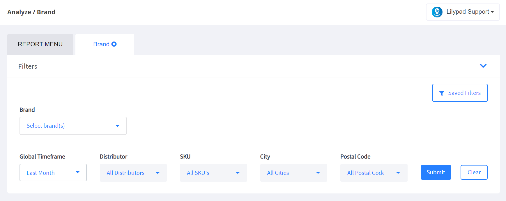
- Choose the brand for which you’d like to run the report
- Select the time frame you’d like the report to present for
- Choose the distributor(s) you would like included
- Choose the SKU(s) you would like included
- Filter down to brand information within specific cities or postal codes
- Click the blue “Submit” button
- NOTE** If you’d like to save these parameters to pull this report more efficiently in the future you can do so by clicking the Saved Filters button in the top right corner of the Filters area. You’d then click on the “Create New From Current Filters” and add a bookmark name and click “Save.” You’ll then be able to automatically pull this report with these pre-set filters at anytime in the future.
- In the report that generates below, you’ll find the following information:
- In the first window:
- Sales Trend – This will show you the total CEs sold for your selected brand for each day on which sales were reported. You can hover over any point on this graph to see the exact number of CEs sold on any given day.
- Total CEs – This shows the total number of CEs sold for that brand during the selected time frame, along with a percentage of either growth or decline in sales in comparison to the same time frame for the prior year
- PODs – This shows the total number of PODs (by account) in which the selected brand was distributed during the selected time frame, along with a percentage of either growth or decline in PODs in comparison to the same time frame for the prior year
- Distributors – This shows the total number of distributors who sold the selected products during the chosen time frame, along with the total number of distributors being reported in your sales data
- Rate of Sale – This shows the rate of sale for the selected brand during the chosen time frame, along with a percentage that shows whether the rate of sale is higher or lower than it was during the same period of the previous year
- Top Accounts:
- Account – The name of your top 5 buying accounts for the selected time frame along with the address for each account
- Rolling 12 mo. Trend – A basic line graph showing the sales trend within each of your top 5 accounts for the last 12 months
- Sales – The total number of case equivalents each account has purchased for the selected brand during the chosen time frame
- Top Distributors:
- Distributor – The name of the top 5 highest selling distributors for the selected brand
- CEs – The total number of case equivalents for the selected brand sold during the chosen time frame
- PODs – The total number of points of distribution (by account) under each distributor’s territory for the selected time frame
- Top SKUs:
- SKU – The name of each of your top 5 selling SKUs
- CEs – The total number of case equivalents sold for each SKU during the chosen time frame
- PODs – The total number of points of distribution (by account) for each SKU
- 12 Month Rolling Volume
- The x-axis in this report will show the volume sold, presented in CEs
- The y-axis in this report will show each of the last 12 months
- You can hover over any point within this graph to see the total number of CEs for this brand sold in any given month
- 12 Month Trend by POD
- In the top right corner of the window you’ll choose whether you’d like the PODs in the graph to be presented by account or by SKU
- The x-axis will show the number of PODs, presented by either Account or SKU based on your selection
- The y-axis will show each of the last 12 months
- You can hover over any point within this graph to see the total number of PODs reported for the chosen brand in any given month
- On Premise vs Off Premise
- This graph will indicate the ratio of your chosen brand’s distribution within On Premise (green) accounts vs. Off Premise (yellow) accounts
- Independent vs Chain
- This graph will indicate the ratio of your chosen brand’s distribution within Independent (blue) vs. Chain (yellow) accounts
- On Premise Independent vs Chain
- This graph will indicate the ratio of your chosen brand’s distribution within on premise independent (green) accounts vs. on premise chain (yellow) accounts
- Off Premise Independent vs Chain
- This graph will indicate the ratio of your chosen brand’s distribution within off premise independent (blue) accounts vs. off premise chain (yellow) accounts
- All Accounts
- Account – The name of each account where this brand was sold during the selected time frame
- Address – The physical address of each account
- # of SKUs – The total number of SKUs each individual account purchased in the selected time frame
- Premise – Whether the account is categorized as an on or off premise account
- Indep/Chain – Whether the account is categorized as an independent or chain account
- Sales (CEs) – The total number of case equivalents sold to each account for the selected brand within the chosen time frame
- Sales (Units) – The total number of units sold to each account for the selected brand within the chosen time frame
- Growth – The percentage that sales within the account have increased or declined by for the selected time frame compared to the same period during the prior year
- Last Invoice – The date on which the last invoice for the selected brand was reported for each account within the chosen time frame
- In the first window: